As an Amazon Associate, we earn from qualifying purchases. Some links on this site are affiliate links at no extra cost to you. Our recommendations are based on thorough research and editorial judgment.
Understanding Color Drenching Techniques
Color drenching is a cohesive interior design technique where a single color is uniformly applied across walls, ceilings, and furniture, creating a tranquil environment that accentuates architectural details. Historical roots trace back to Georgian and Victorian eras, evolving through modern adaptations. Designers utilize various finishes to add depth, ensuring small spaces feel larger and harmonious. The importance of testing colors under different lighting is pivotal to achieving an ideal aesthetic. Explore further to uncover the nuances behind this innovative approach.
Key Takeaways
- Color drenching applies a single color across walls, ceilings, trim, and furniture for a cohesive and visually unified environment.
- It enhances architectural details and minimizes visual clutter, making small spaces feel larger and more calming.
- Using variations in color shades or finishes adds depth while maintaining a monochromatic scheme for visual interest.
- Ideal spaces for color drenching include libraries, powder rooms, and bedrooms, promoting comfort and cohesion through strategic color choices.
- Testing paint samples in different lighting ensures the final look aligns with the homeowner’s vision and enhances the intended atmosphere.
What Is Color Drenching?
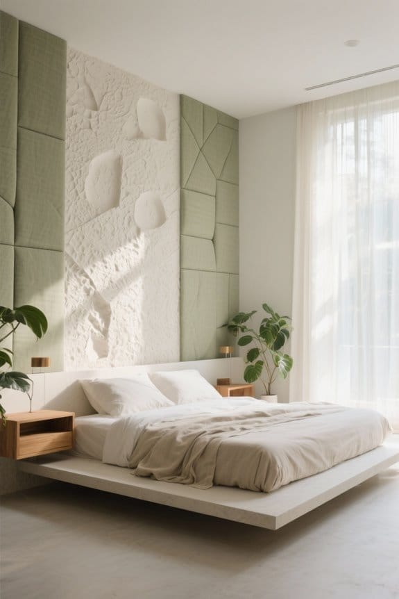
Although it may seem simple at first glance, color drenching is a sophisticated interior design technique where a single color is applied uniformly across all surfaces of a room, including walls, ceilings, trim, and often even furniture. This method creates a cohesive environment that emphasizes the essence of design by allowing architectural elements, like moldings and doorways, to stand out without contrasting colors distracting from them. When rooms are painted the walls in one color, designers can also use variations in finishes or shades to create the illusion of depth and interest. Particularly effective in smaller spaces like powder rooms or libraries, color drenching maximizes space perception and fosters a calm, tidy atmosphere, blending unattractive features seamlessly into the overall aesthetic. Additionally, the flexibility offered by narrow accent cabinets allows for stylish storage solutions that complement the unified color palette.
Historical Background of Color Drenching

Color drenching has a rich historical context that reveals its evolution as a significant design technique for creating harmonious spaces. With historical roots in the UK, this method first emerged during the Georgian and Victorian eras, celebrated for their vibrant color applications across various surfaces. Historically, color drenching involved seamlessly applying a single hue to walls, ceilings, and trim, effectively masking unsightly architectural elements. In the mid-century, modern designers reignited interest in color drenching, infusing it with contemporary flair while adapting classic principles to suit modern tastes. Today, the rise of social media has further enhanced its visibility, making color drenching a favored choice in interior design practice, appealing to those who appreciate cohesive and striking environments. Contemporary bookshelves reflect the versatility encouraged by color drenching, offering functional yet stylish options for displaying literature and decor.
Benefits of Color Drenching

Utilizing color drenching can transform interior spaces into harmonious environments, as it allows for a unified application of a single hue across walls, ceilings, and trim. One significant benefit of color drenching is its ability to create mood, promoting tranquility through a monochromatic scheme. This technique is particularly effective in small spaces, as it eliminates visual noise by minimizing contrasting colors, thereby making rooms appear larger and more open. Drenching can create a cohesive look that conceals unattractive features by blending them seamlessly into the background. Furthermore, incorporating different finishes adds depth while maintaining uniformity, preventing monotony. Ultimately, color drenching enhances architectural details, providing a polished aesthetic that elevates any interior setting. Additionally, the use of adjustable lighting options can further amplify the calming effects of a color-drenched space, enhancing the overall ambiance.
Recommended Products

ABOUT US : Urban Ambiance, Inc. is a U.S. brand of luxury, urban-inspired light fixtures, with company headquarters in Reno, NV. Each of our products meets or exceed U.S. standards for electrical safety and durability. With warehouses on both the East and West coasts, and friendly U.S.-based customer service, we encourage you to reach out and let us show you how we earn over 10,000 customers a year.

Black and Gold Abstract Marble Stone Peel and Stick Wallpaper | Removable Wall Mural #6239
Giclee artwork, printed on high quality archival grade canvas
Considerations for Using Dark Paint
Applying dark paint can introduce a bold and sophisticated aesthetic to any space, but several essential considerations are necessary for achieving the desired effect. Dark colors like navy blue or deep Bordeaux can create an elegant atmosphere, though they may not enhance spatial perception in smaller rooms with inadequate lighting conditions. To avoid an oppressive feel, contrasting tones should be employed in high-ceiling areas, maintaining visual interest. Testing paint samples within the actual space is vital, as colors may appear different under various lighting. Choosing finishes such as semi-gloss or matte can further enrich the dramatic effect, offering varied texture. Ultimately, personal preferences should guide color selection, always considering how hues interact with available light. Additionally, incorporating customizable features like paintable cord covers can help maintain a cohesive design throughout the room.
Recommended Products

This elegant 24K gold necklace features an auspicious “Ping An Lock” pendant, crafted with traditional goldsmithing and detailed with a textured finish. The pendant is accented by enamel-painted Baoxiang flowers, creating a soft gradient effect that adds depth and grace. Paired with a gold bead engraved with “Bamboo” (竹) and “Bat” (蝠) — symbols of good luck and longevity — this piece beautifully blends classic charm and heartfelt blessings, symbolizing peace, happiness, and lasting prosperity.

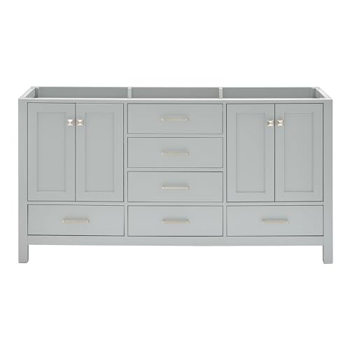
COMPLETE MASTER SUITE TRANSFORMATION - Eliminate the stress of mismatched finishes with this curated 102 inch bathroom vanity set. This all-in-one luxury master bath vanity set provides a cohesive, designer-coordinated look that includes two mirrors and two linen closets, creating the ultimate his and hers vanity with storage solution for your forever home.

Total weight capacities: multi-use lockers 800 lbs. , wall cabinets 100 lbs. , rolling tool cabinets 600 lbs. , and base cabinets 600 lbs.
Ideal Spaces for Color Drenching
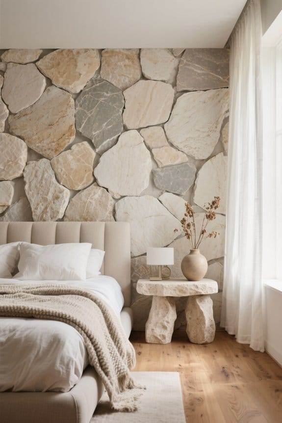
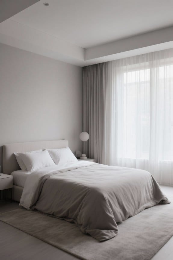
When considering the ideal spaces for color drenching, it is essential to recognize how different environments can influence the effectiveness of this technique. Powder rooms transform into luxurious “jewel boxes” through cohesive color schemes, while libraries and dens benefit from deep tones that enhance mood and warmth. Hallways utilizing color drenching minimize visual breaks, fostering an illusion of greater space and visual continuity throughout the home. Bedrooms, with soft, mid-tone colors, serve as tranquil retreats that promote restful sleep. Additionally, awkwardly shaped rooms gain from color drenching, smoothing out visual quirks and creating a harmonious flow. Ultimately, these ideal spaces highlight the technique’s power to redefine and elevate interiors with purposeful color choices. Incorporating dimmable lighting options along with color drenching can further enhance the ambiance of these spaces.
Techniques for Effective Color Drenching
Achieving effective color drenching requires more than just applying a coat of paint; it involves a thoughtful integration of color across every surface within a space. Techniques for successful color drenching include using a single hue across walls, ceilings, trim, and even furniture, creating a seamless immersive look. Varying paint finishes, like matte for walls and semi-gloss for trim, can enhance depth without disrupting color uniformity. Attention to architectural details is essential; selecting molding that harmonizes with the overall scheme avoids jarring contrasts. Finally, understanding the emotional impact of colors—where softer tones promote serenity and darker shades offer intimacy—tailors the experience to the room’s purpose, ensuring that every choice resonates with the intended atmosphere. Additionally, using adjustable designs can enhance functionality and allow for customizable light angles that complement the color scheme.
Sampling Colors for Drenching
Sampling colors for drenching plays an essential role in achieving a cohesive and harmonious design scheme, as it allows homeowners and designers alike to visualize how various hues will interact within a given space. Testing paint samples in small sections is important to understand how different shades react with the room’s natural light and existing decor. Utilizing products like Samplize Peel-and-Stick samples enhances this process, providing a mess-free option for quick assessment. It’s vital to evaluate each color for all surfaces, including different finishes, as variations between matte and gloss can drastically alter perception. Observing samples at different times of day guarantees a well-rounded view of color dynamics, leading to a thoughtful final choice. Additionally, considering elements like hypoallergenic materials can help create a healthy environment within the designed space.
The Role of Texture and Finish in Color Drenching
Texture and finish are pivotal elements in the art of color drenching, greatly influencing the overall aesthetic and ambiance of a space. The choice of paint finish—ranging from matte to semi-gloss—can greatly enhance or diminish the visual impact of a monochromatic color scheme. For instance, a matte wall paired with semi-gloss trim not only creates contrast but also maintains cohesion within the color palette. In addition, incorporating textures such as wood or plaster introduces depth, preventing a room from appearing flat. Designers like Farrow & Ball emphasize the importance of ceiling texture; a smooth ceiling complements drenching by ensuring a seamless look. Ultimately, careful consideration of finishes against lighting conditions guarantees the intended effect is achieved without overwhelming the space. Furthermore, exploring the use of smart oil diffusers can enhance the sensory experience in a color-drenched environment by adding aromatherapy to the ambiance.
Recommended Products
【Premium Vanity Construction】 The Cambridge 66-inch bathroom vanity crafted from premium solid hardwood and plywood for superior strength and durability. Ariel Grey 66" bathroom vanity provides a longer lifespan than MDF or particle board cabinets and resists moisture, warping, cracking, and paint peeling. A Sherwin-Williams PU coating delivers a durable finish that withstands daily wear and tear. Hidden leveling feet deliver a stable, wobble-free fit on uneven floors.
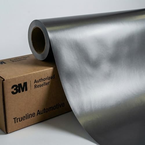
✓ EXACT SIZE: 5ft x 30ft (150 sq ft) - Premium 3M 2080 Series vinyl wrap film precisely cut for your project, ideal for vehicle accents, chrome delete, trim wrapping, or full coverage applications

The high-quality ZWILLING sharpness you’ve come to expect
Consultation Services for Color Drenching
Consultation services for color drenching play a significant role in transforming spaces, as they offer personalized guidance tailored specifically to the preferences and needs of each homeowner. Color consultants analyze architectural features and recommend color selection strategies that enhance a home’s unique characteristics. Utilizing tools like mood boards, they help visualize cohesive designs by harmonizing color palettes with existing decor. Many design professionals now provide online consultations, making expert advice accessible regardless of location. Importantly, high-quality services underscore testing paint colors in various lighting conditions, ensuring that the final result aligns with a homeowner’s vision. This thoughtful approach to color drenching fosters an inviting atmosphere, supported by the use of textures and finishes that add depth and interest. Additionally, understanding multiple storage options can significantly enhance the functional aspects of a room.
Key Takeaways on Color Drenching
Color drenching serves as a powerful design technique that transforms spaces into harmonious environments by applying a single color across all surfaces, including walls, ceilings, trim, and furniture. This method enhances architectural details, expands the perceived space, and promotes tranquility through a simplified color palette. Designers often recommend using various finishes, such as matte and gloss, within the same color family to prevent monotony and add depth. Testing paint colors in small areas is essential, as lighting greatly influences color perception. Commonly used in intimate spaces like powder rooms or cozy libraries, color drenching enriches the atmosphere, creating an immersive experience that simplifies distractions and highlights the allure of well-coordinated designs. Additionally, just like selecting a rug, choosing durability and comfort in color drenching ensures a lasting and pleasing aesthetic.
Frequently Asked Questions
What Is the Rule of Color Drenching?
The rule of color drenching involves applying color theory to achieve psychological effects and color harmony through unified hues across surfaces. This technique enhances interior design, allowing vibrant palettes and thoughtful fabric selection to create cohesive environments.
What Are Some Common Drenching Mistakes?
Color palette selection often clashes with common design pitfalls. Ignoring color theory basics can lead to inappropriate complementary colors, while overlooking varied shades and tints may hinder effective drenching techniques, resulting in uninviting, flat spaces.
What Is the 60 30 10 Rule With 4 Colors?
The 60-30-10 rule applies color balance by allocating 60% to a dominant hue, 30% to secondary colors, and 10% to accent colors, fostering complementary schemes that enhance color harmony and mood through intentional color psychology.
What Are Some Color Drenching Mistakes?
Common color drenching errors include neglecting light variations, ignoring paint finishes, mismatching colors with room function, improper ceiling preparation, and overlooking furniture arrangements, all of which hinder effective blending techniques and maintaining balance in chosen palettes.